Watermelon
Client Watermelon
. . . . . . . . . . . . . . . . . . . . . . . .
Country Jordan
. . . . . . . . . . . . . . . . . . . . . . . .
year 2023
Role
Branding · Visual Identity · Art Direction
Idea
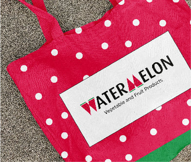
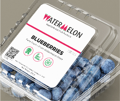
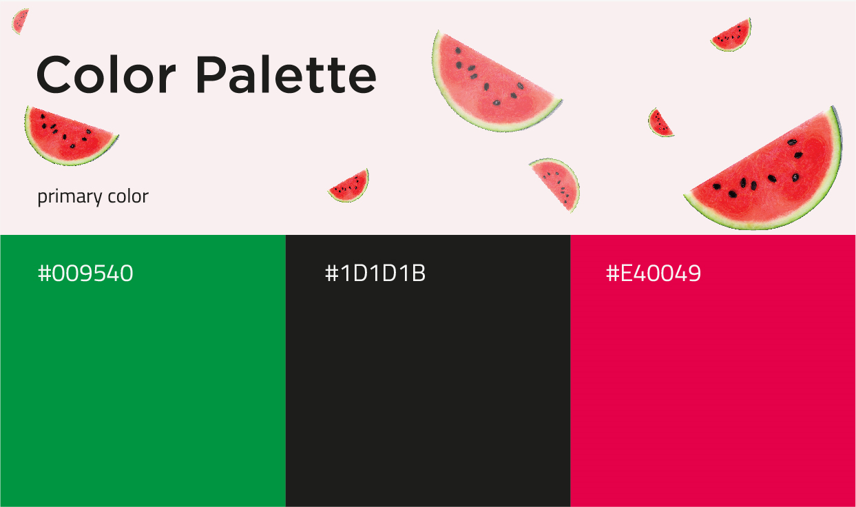
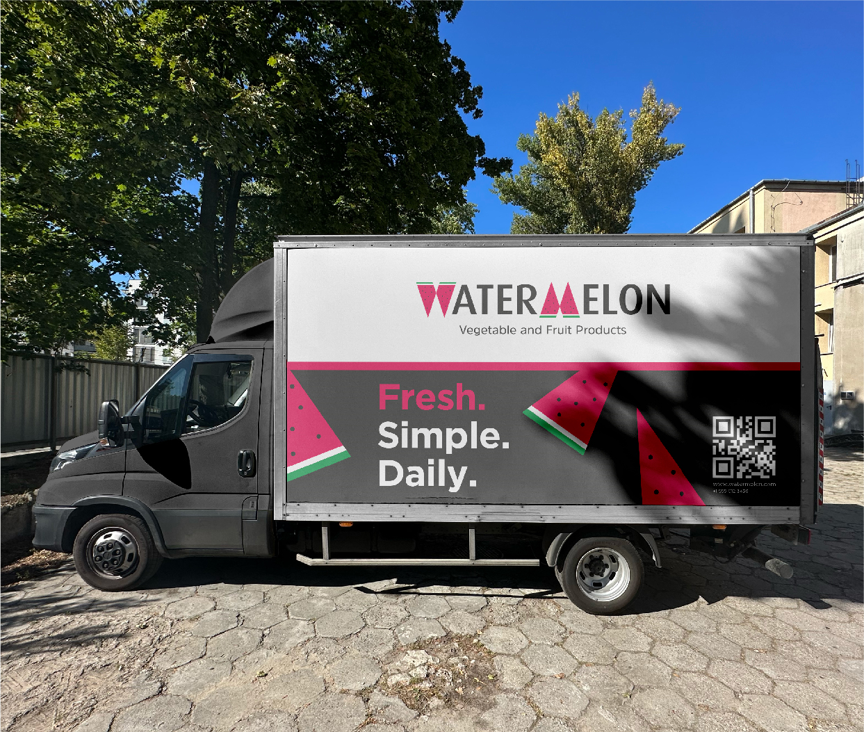
Inspired by the watermelon as a symbol of freshness and natural goodness, the brand identity celebrates local produce through a clean, vibrant, and approachable visual language. Featuring bold typography, fresh colors, and simple organic elements, the flexible identity creates a consistent and recognizable experience across packaging, signage, and digital platforms while making the brand feel honest, accessible, and memorable.